I had designed a number of event posters for The Long Time (and even screen printed a few) but I felt that none had demonstrated the full design and production faculties of our burgeoning print practice. I asked my lovely and talented partner, Greta Rasmus, if she would agree to collaborate on the June 2018 game between the Texas Playboys and visiting The Mississippi Flood.
filed under: poster design, illustration, print design, screen printing, social media // tools: illustrator, photoshop, paper, ink, screen
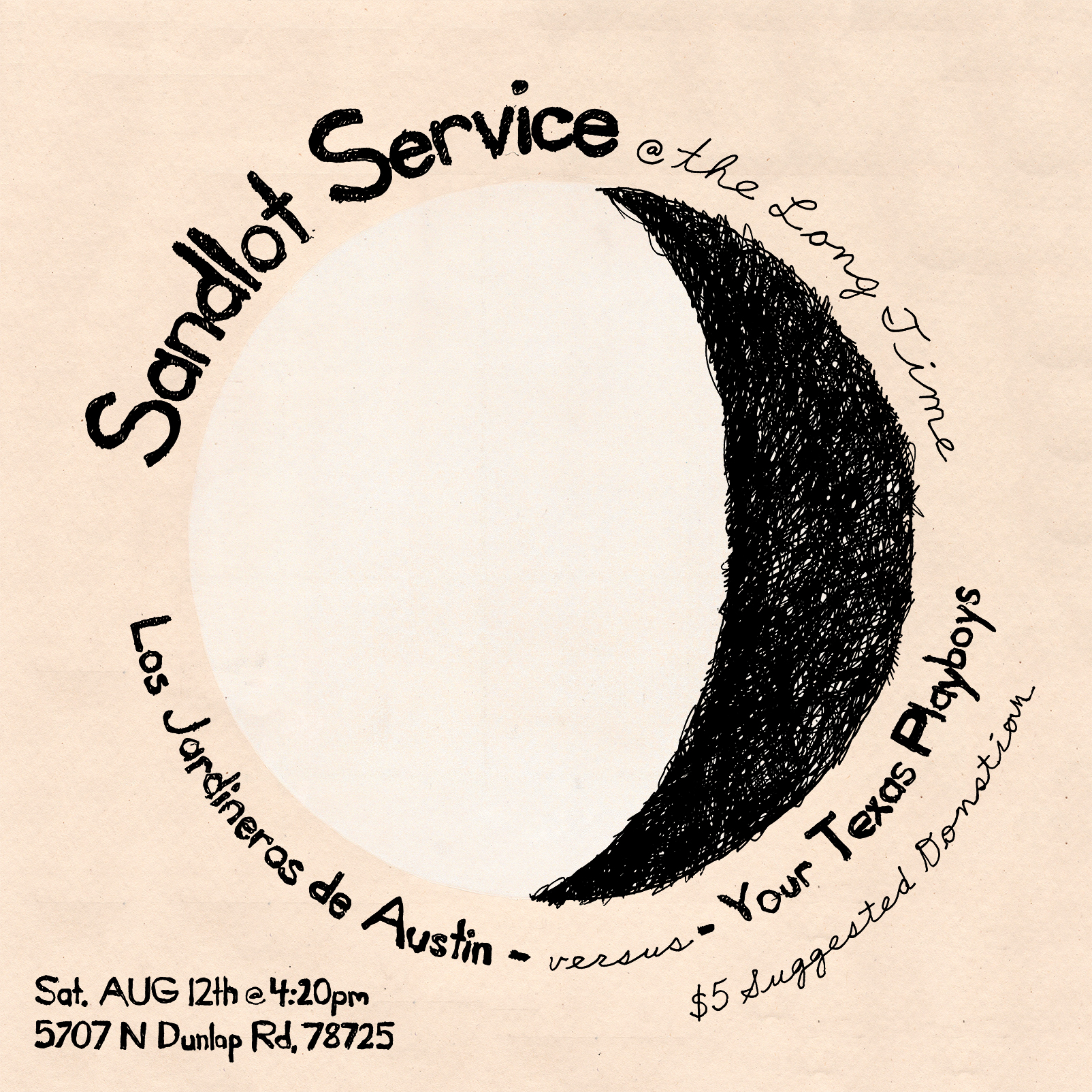
CONCEPT
After shooting some ideas back and forth, Greta and I decided we’d focus on the iconic image of a pitcher on the mound. With the idea that we’d make a poster with one strong illustrative element around and over which type would be set, I made a sketch based on the classic Juan Marchial high kick, where the shadow of the pitcher was projected down the slope of the mound and onto the flat plane of the grass.

Preliminary figure and layout sketches.

The flexible Mr. Marchial.
GIMMICK
At this point we came up with the central “gimmick” or the poster: If we arrayed the type correctly, the poster could be mounted and read in any orientation based, in our minds anyways, on the fan’s routing interest. Either way, we felt the poster benefitted from a rotational symmetry, feeling balanced but dynamic.
TYPE
Greta took the sketch and made a pass at the type. We thought we had several strong schemes and resolved to bring the placeholder illustration back up to par. We ended up with the line-solid version you see on the finished piece, but in one color and on his own. We found that it felt like he was floating in the composition so we copied and rotated him, ending up with a composition that felt resolved even while staying centrally-located.


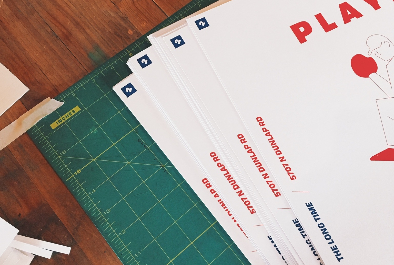
PRINTING
A late night printing at Satch Grimley’s place and a remarkably long time initialing and numbering the final prints later and we had the pieces in our hands.


GIF
The only thing remaining was to format it for social media, after all we couldn’t exactly “paper the town” with our edition of 30. I’d always had in the back of my mind that a square would work well on instagram and facebook, so I hadn’t worried about it. But Greta, ever one to re-consider the design, showed me an arrangement of characters she had made by arranging the letters in “Playboys” and “Flood” in a cloud amongst the players. While a little illegible, it was good-looking and suggested movement, so I made a gif of the letters re-arranging themselves and the poster rotating itself lest anyone forget the aforementioned gimmick.
TLDR: Greta’s talented. *Pitching* a design back and forth can move it forward. Physical posters are a really nice thing. Satch is an angel. Don’t forget social media; GIFs are a GIFn. (It’s not “JIF” ok?)
see also: